
Let’s be honest.
We’ve all had that moment when we open Canva, Photoshop, or another design tool, stare at the blank screen for five minutes, and still have absolutely no idea what to put on it.
You know what you want to say.
You might even have the perfect photo.
But somehow, the finished post still doesn’t look the way you imagined.
The problem usually isn’t the design software.
It’s the idea.
A good social media design doesn’t necessarily need complicated graphics, dozens of colors, or expensive software. Sometimes, a simple layout with the right image, typography, and spacing can look much better than an overly complicated design.
So, if you’re running a small business, managing a social media page, building a personal brand, or simply trying to make your Instagram feed look better, here are 20 social media design ideas worth trying.
1. Start With a Strong Statement
One of the easiest ways to create an attractive social media post is to make the message the design.
Instead of filling the graphic with information, choose one strong sentence and make it the main visual element.
For example:
“Your brand has 3 seconds to make an impression.”
Put that sentence in large typography against a simple background.
You don’t need ten icons.
You don’t even need a complicated illustration.
Just good typography, good spacing, and a background that supports the message.
This style works particularly well for business pages, motivational accounts, marketing agencies, and personal brands.
2. Use a Product as the Main Character
If you’re selling something, don’t hide your product somewhere in the corner.
Make it the star.
Imagine you’re advertising a perfume.
Instead of creating a busy graphic with the product, price, discount, phone number, address, and ten decorative elements, try something simpler.
Place the perfume bottle in the center.
Give it dramatic lighting.
Use a clean background.
Add a short headline such as:
Made for the moments that matter.
Then put the details somewhere secondary.
This immediately gives the product more importance and can make an ordinary product photo feel like a professional advertisement.
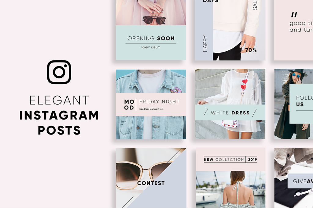
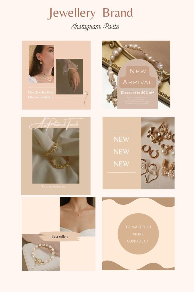
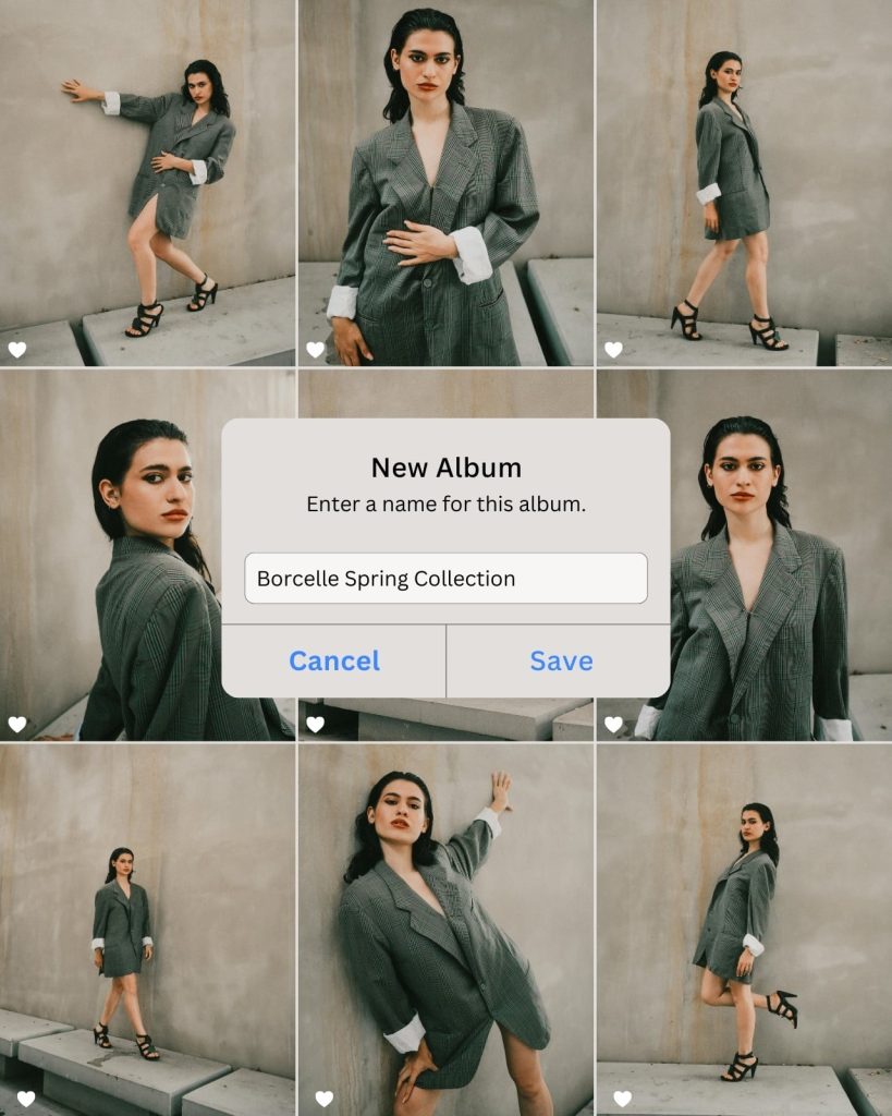
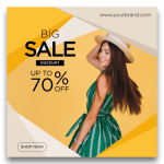
3. Try the “One Big Photo” Layout
Sometimes the best design is simply a really good photograph.
Use one large, high-quality image and let it occupy most of the canvas.
Then add a small amount of text.
Etcetera
For example:
SUMMER 2026
New collection now available.
That’s it.
This approach works especially well for:
- Fashion
- Travel
- Restaurants
- Hotels
- Lifestyle brands
- Photography
- Real estate
The key is choosing a photograph that is visually interesting enough to carry the design.
4. Create a Before-and-After Post
People naturally want to see transformations.
That’s why before-and-after posts work so well.
You could use this idea for:
- Home renovations
- Graphic design
- Photography editing
- Fitness
- Makeup
- Hair styling
- Cleaning services
- Website redesigns
- Interior design
Divide your design into two sections.
BEFORE
and
AFTER
Keep everything else simple.
The transformation itself becomes the content.
5. Turn a Tip Into a Graphic
You don’t always need to write a long caption.
Take one useful tip from your industry and turn it into a visual.
For example, a photography page might post:
TIP:
Don’t use your phone’s digital zoom when taking product photos.
A web designer could say:
TIP:
Your website’s first impression matters more than you think.
A fitness page could say:
TIP:
Consistency beats the perfect workout plan.
One useful idea can become an entire social media post.
And if your audience finds it useful, they’ll be much more likely to save or share it.
6. Use a Carousel to Tell a Story
Not every idea needs to fit into one image.
If you have more to say, use a carousel.
For example:
Slide 1
5 Mistakes Making Your Instagram Look Unprofessional
Slide 2
1. Too Many Fonts
Slide 3
2. Poor-Quality Images
Slide 4
3. Too Many Colors
Slide 5
4. No Consistent Style
Slide 6
5. Too Much Text
Slide 7
Here’s What to Do Instead
This format gives people a reason to keep swiping.
And that’s the whole point.
Don’t try to put the entire article on the first slide.
Give people a reason to see the next one.
7. Create a “Did You Know?” Post
People love discovering something they didn’t know.
Create a simple graphic around an interesting fact related to your niche.
For example:
DID YOU KNOW?
Most people form an impression of a website within seconds.
Or:
DID YOU KNOW?
Color can influence how people perceive a brand.
Keep the design simple and let the information do the work.
8. Use a Question as Your Headline
Instead of telling people something, ask them something.
For example:
Which logo would you choose?
Then show three different options.
Or:
What’s your biggest social media design problem?
A: Finding ideas
B: Choosing colors
C: Making graphics
D: Writing captions
This type of post can encourage people to comment.
And comments can turn a static design into an actual conversation.
9. Create a Minimalist Quote Post
Quote posts are everywhere, but that doesn’t mean they have to look boring.
The trick is restraint.
Choose:
- One background
- One or two fonts
- One quote
- Plenty of empty space
For example:
“Good design is not about adding more.
It’s about knowing what to remove.”
A simple design can sometimes feel much more premium than a complicated one.
10. Show the Person Behind the Business
This is something many businesses overlook.
People don’t only want to see products.
They want to see people.
If you’re running a small business, consider creating a post introducing yourself.
Something as simple as:
Hi, I’m Ahmed.
I started this business because I couldn’t find [problem].
Today, we’re helping [audience] do [result].
Add a good photograph and keep the design clean.
This can make a brand feel much more personal.
11. Turn Customer Reviews Into Designs
You don’t always have to create new content from scratch.
Your customers may already be creating it for you.
Take a genuine customer review and turn it into a social media graphic.
For example:
“The quality was even better than I expected.”
— Sarah, Lahore
Add your brand logo and a subtle background.
That’s your post.
And unlike a generic marketing statement, a real customer experience can feel much more believable.
12. Create a “3 Things You Should Know” Post
People like small, digestible pieces of information.
Try formats such as:
3 Things Every Small Business Should Know About Instagram
or
3 Things to Check Before Publishing Your Website
or
3 Design Mistakes You Should Stop Making
The number doesn’t have to be three.
You can use:
- 3
- 5
- 7
- 10
But don’t add points just to reach a number.
If you have three genuinely useful things to say, three is enough.
13. Use a Strong Color Combination
You don’t need ten colors to make a design interesting.
In fact, using too many colors can make a design feel messy.
Try choosing:
One main color + one supporting color + a neutral
For example:
- Navy + gold + white
- Black + beige + white
- Green + cream + dark gray
- Blue + white + light gray
Once you find a combination that works for your brand, keep using it.
That consistency eventually becomes part of your visual identity.
14. Create a “New vs. Old” Design
If you’ve redesigned something, show people the difference.
For example:
OUR OLD WEBSITE
↓
OUR NEW WEBSITE
Or:
OLD LOGO
↓
NEW LOGO
People are naturally curious about transformations.
It also gives you an opportunity to show your design skills without simply saying:
“Look how good we are.”
You’re actually showing them.
15. Make a Seasonal Design
Your content doesn’t always have to be evergreen.
Use what’s happening around your audience.
Examples include:
- Ramadan
- Eid
- New Year
- Back-to-school season
- Summer
- Winter
- Valentine’s Day
- Independence Day
- Black Friday
- Wedding season
A clothing store, for example, could create:
Your Eid Look Starts Here
with a beautiful product photograph and a seasonal color palette.
Seasonal content can also give people a reason to engage with your brand right now.
16. Create a Behind-the-Scenes Post
Your finished product isn’t the only interesting part.
Show people how you got there.
A restaurant could show:
Ingredients → Preparation → Cooking → Final Dish
A designer could show:
Sketch → First Concept → Revision → Final Design
A photographer could show:
Setup → Shoot → Editing → Final Photo
People enjoy seeing the process.
It makes your work feel more real.
17. Turn a Common Problem Into a Post
Think about the questions people constantly ask you.
Then turn one of those questions into a design.
For example:
Why does my Instagram design look blurry?
Or:
Why isn’t my website getting visitors?
Or:
Why do my product photos look cheap?
The question becomes the headline.
The caption provides the answer.
This is one of the best ways to create content because you’re not guessing what people might want.
You’re answering something they already want to know.
18. Create a “Save This” Checklist
Create a useful checklist that people might want to return to later.
For example:
Before You Publish Your Instagram Post
☐ Is the text readable?
☐ Is the main message obvious?
☐ Is the image high quality?
☐ Are the colors consistent?
☐ Is there enough empty space?
☐ Is the call to action clear?
☐ Does it look good on a phone?
This type of content can be especially useful because people may save it for later.
19. Create a Simple Comparison
People love comparisons.
You could create posts such as:
Minimalist vs. Maximalist Design
Serif vs. Sans Serif Fonts
Light Theme vs. Dark Theme
Professional vs. Amateur Advertisement
Old Design vs. New Design
Show both options side by side.
Then ask:
Which one would you choose?
Now you’ve created both a visual comparison and a conversation starter.
20. Don’t Be Afraid of Empty Space
This might be the most important idea on the entire list.
A design doesn’t have to fill every corner.
Empty space — often called negative space — can actually make a design easier to understand.
Imagine a poster with:
- Five different fonts
- Eight colors
- Three photographs
- Multiple shapes
- Several icons
- Lots of text
Now imagine the same poster with:
- One strong image
- One headline
- One supporting sentence
- Two colors
- Plenty of empty space
Which one looks more professional?
Usually, the second.
Good design isn’t always about adding something. Sometimes it’s about knowing what to leave out.
How to Make Your Social Media Designs Look Consistent
Here’s something many people don’t think about when they’re creating individual posts.
Your posts shouldn’t necessarily look completely different from one another.
If you’re building a brand, try creating a visual system.
Choose:
Your colors
Pick 2–4 colors that appear regularly.
Your fonts
Choose one font for headlines and another for supporting text.
Your image style
Maybe you prefer bright photography, dark cinematic images, or clean minimalist images.
Your layout
You could consistently place your logo in the same area or use a recognizable headline style.
After several weeks, people may start recognizing your posts before they even read your username.
That’s when design starts doing something much more valuable than simply making a post look nice.
It starts building brand recognition.
You Don’t Need to Be a Professional Designer
If you’ve ever looked at a beautiful Instagram page and thought:
“I could never make something like that.”
Don’t worry.
Most good design comes down to a handful of principles:
Keep it simple.
Create a clear hierarchy.
Use good images.
Don’t use too many fonts.
Don’t use too many colors.
Give your content room to breathe.
And most importantly:
Start creating.
Your first ten designs probably won’t be your best.
That’s completely fine.
You’ll learn something from every one of them.
Use AI to Get Design Ideas Faster
You can also use AI to overcome that frustrating moment when you simply don’t know what to create.
Instead of asking:
“Give me a social media design.”
Give the AI some context.
Tell it:
- What your business is
- Who your audience is
- What you’re promoting
- What style you like
- What colors you use
- Where the design will be published
For example:
Create five Instagram post concepts for a small Pakistani clothing brand targeting women aged 20–35. The brand has a modern, elegant identity using cream, dark green, and gold. Suggest different layouts for product launches, customer testimonials, seasonal promotions, educational posts, and lifestyle content.
You’ll get much more useful ideas.
And if you want ready-to-use prompts, check out our previous guide:
[50 AI Prompts for Social Media Designs]
Final Thoughts
Creating good social media graphics isn’t about making every post complicated.
Sometimes a simple photograph and a strong headline are enough.
Sometimes a useful tip is enough.
Sometimes the best post is simply a genuine picture of the person behind the business.
The important thing is to stop thinking about design as decoration.
Design is communication.
Before opening your design software, ask yourself:
What do I want someone to understand when they see this?
Once you know the answer, designing the post becomes much easier.
And if you’re staring at a blank canvas right now, don’t worry.
Pick one of the 20 ideas above.
Give yourself 20 minutes.
Make something.
It doesn’t have to be perfect.
It just has to exist.
🎨 Want More Design Ideas?
At YouDesign, we’re building a place for people who want to create better digital content without needing to be professional designers.
From AI prompts and design inspiration to practical tutorials and online creative tools, our goal is simple:
Give you the ideas and tools to turn your ideas into something worth sharing.
Keep exploring YouDesign for more creative inspiration, design tips, and AI-powered ideas.

Pingback: 10 Best AI Design Tools for Creating Stunning Images in 2026 - YOU DESIGN